We'll Find Visualization
For You
or Choose Chart
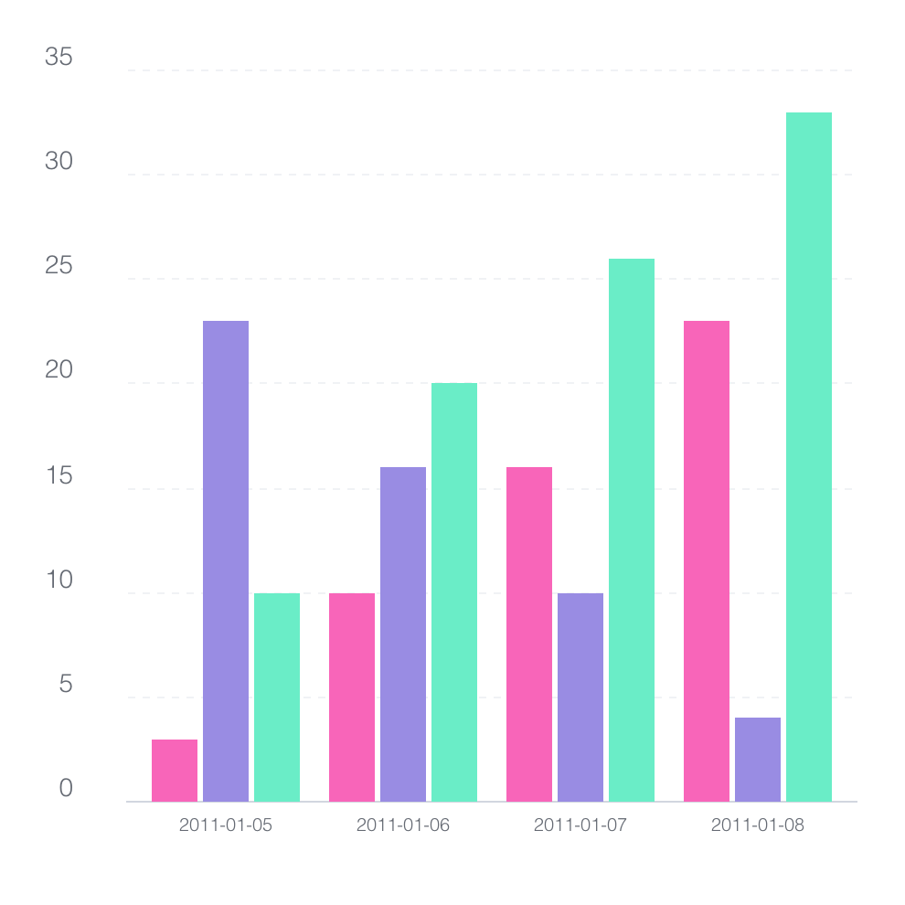
Bar Chart
This bar chart displays the comparison of data across multiple categories, with each bar representing a distinct value.
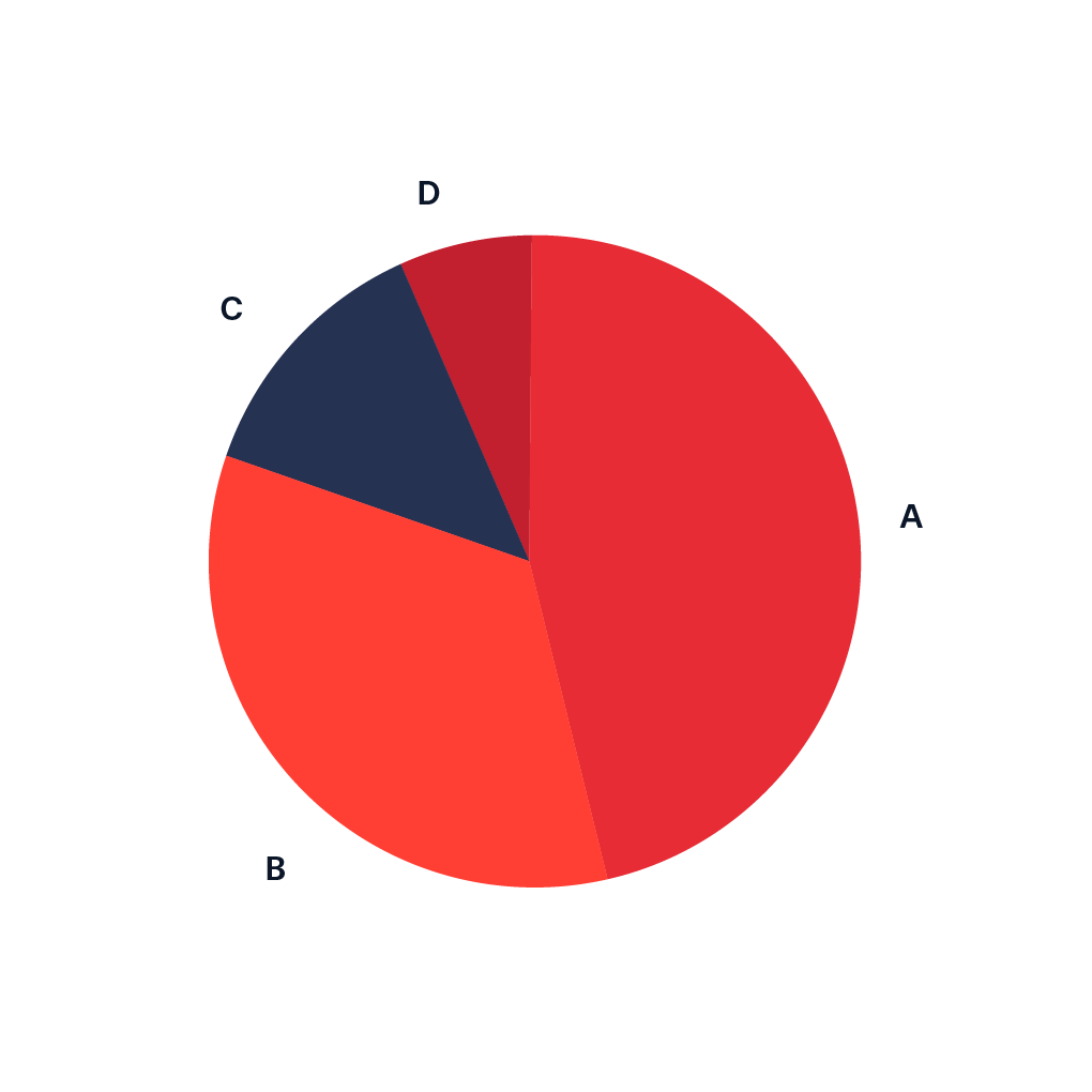
Pie Chart
A pie chart shows proportions of a whole as slices of a circle, with each slice representing a category's percentage.
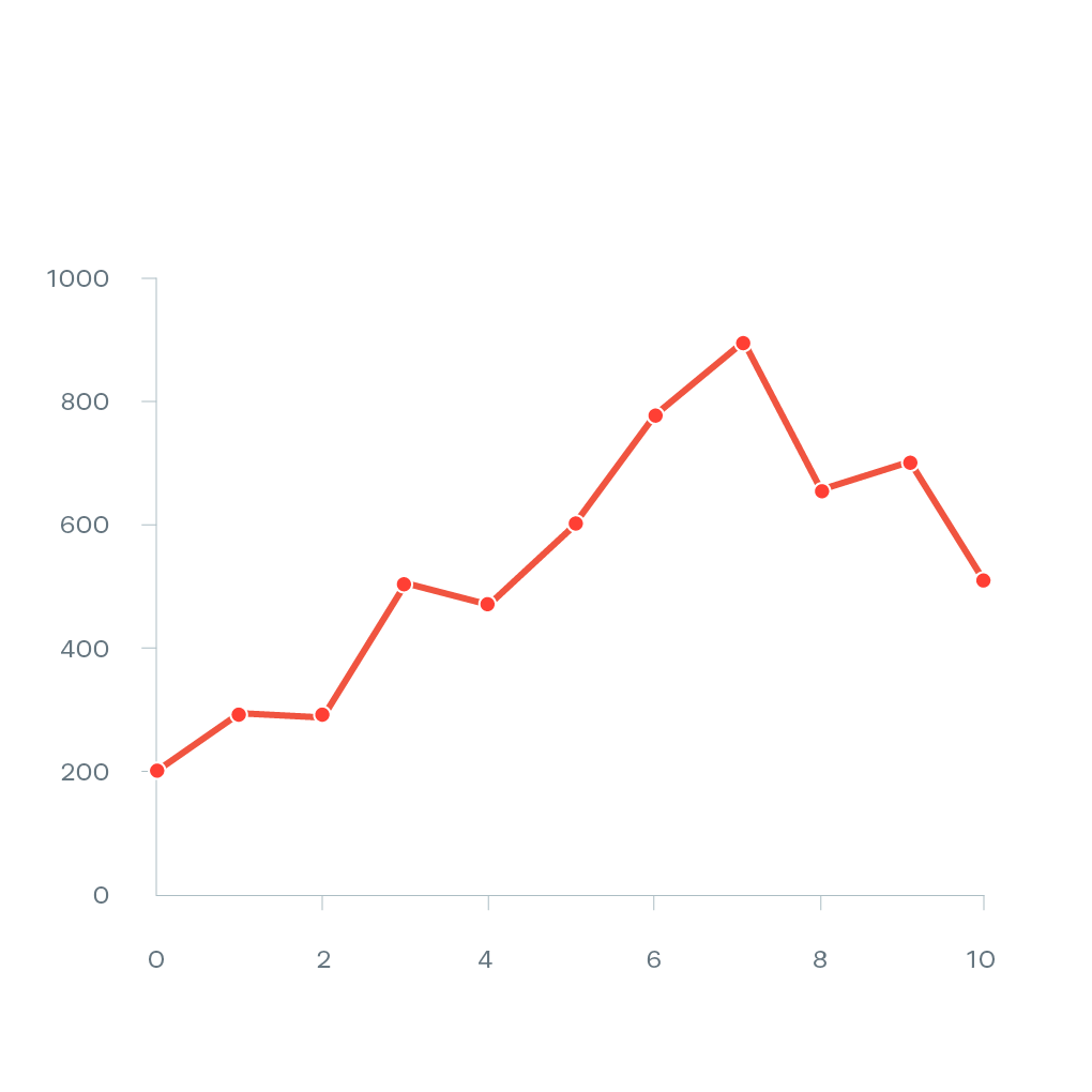
Line Chart
A line chart displays data points connected by straight lines, showing trends or changes over time.
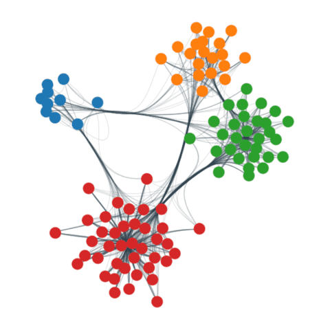
Network Graph
The network graph lets you draw a network of connected nodes and edges from a data set to a sheet.
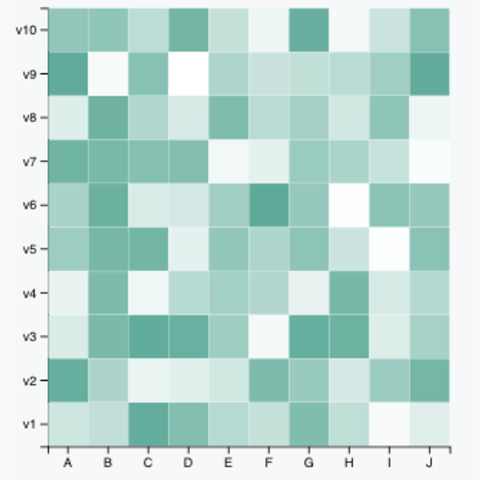
Heatmap
A heatmap displays data values in a matrix format, using color gradients to represent the intensity or magnitude of values.
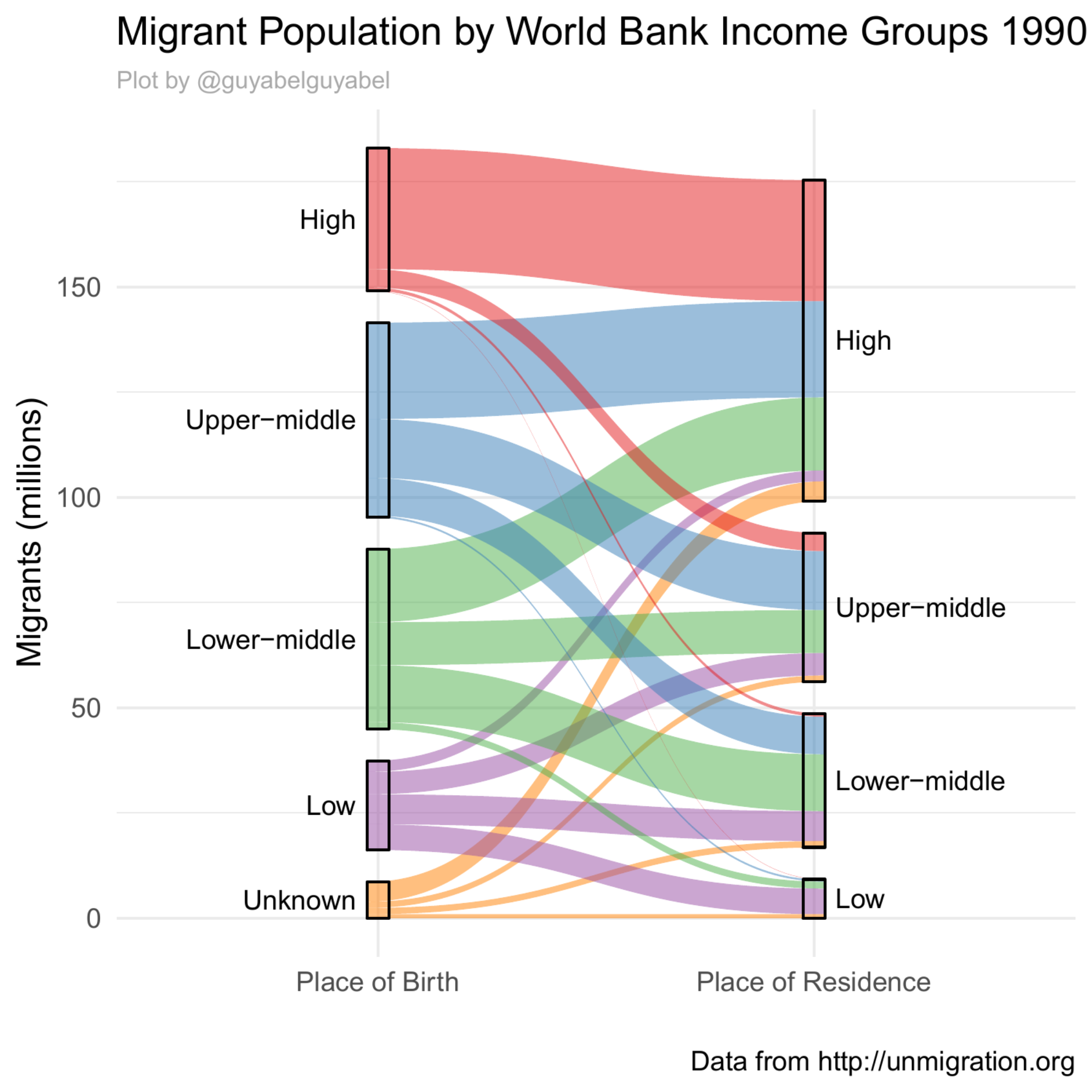
Sankey Diagram
A Sankey diagram visualizes the flow of resources, energy, or information between entities.