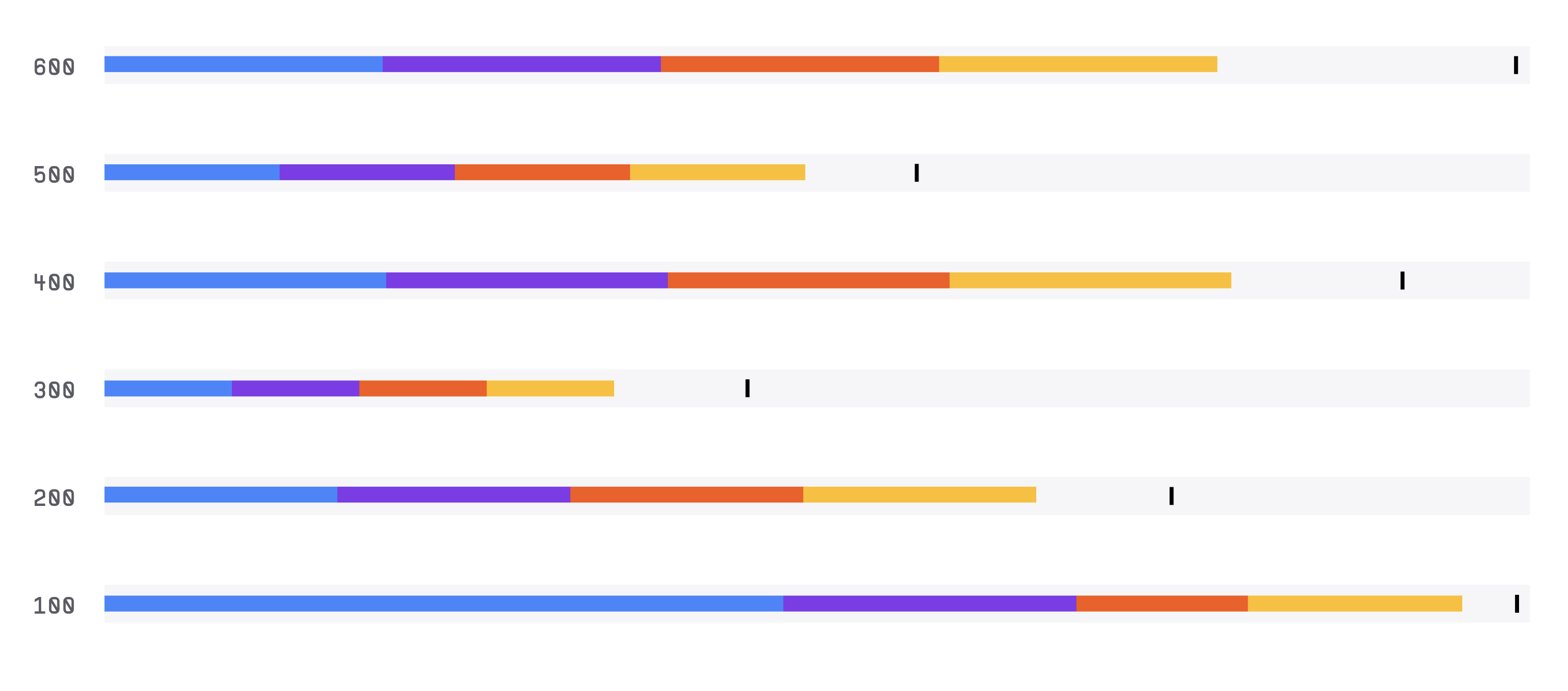
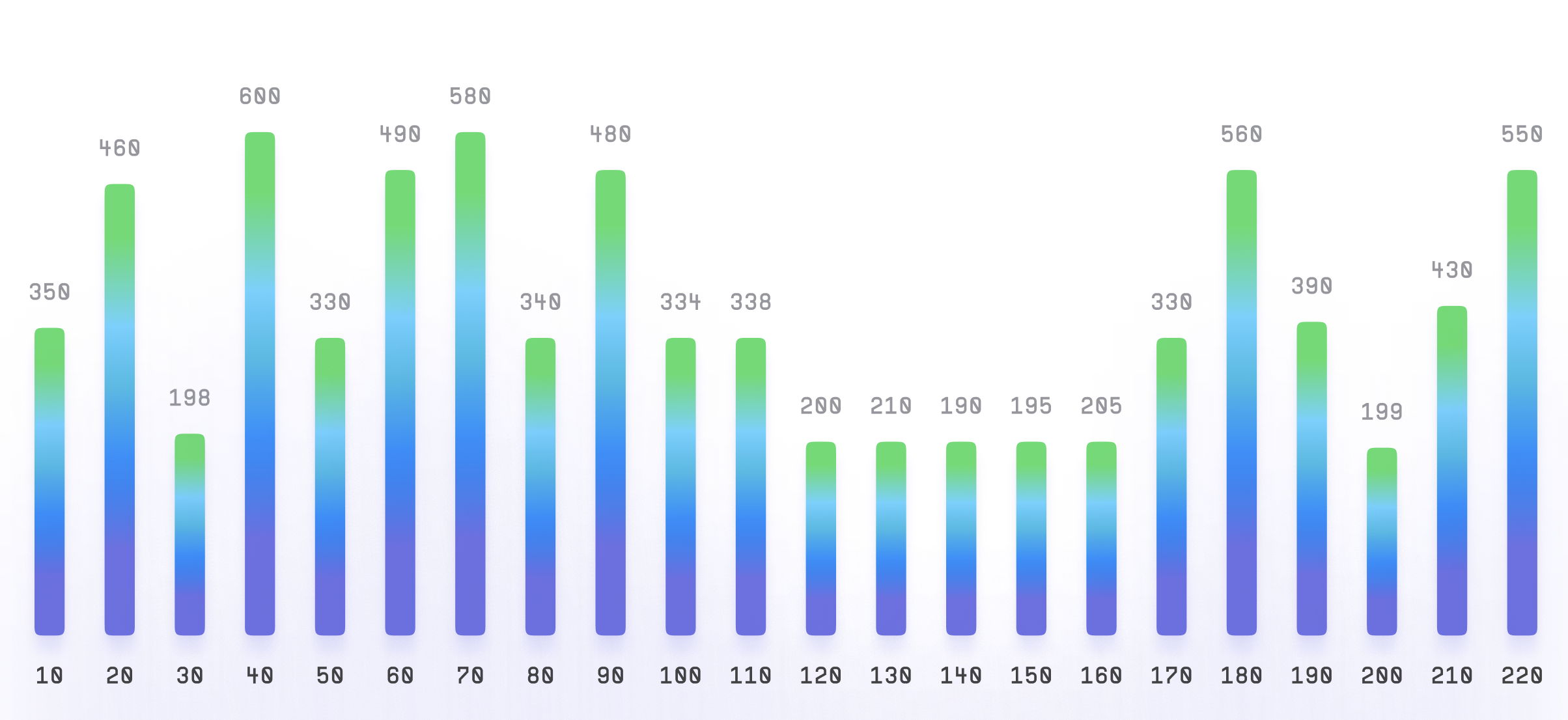
Bar Chart
Bar chart, also known as a bar graph, is a type of chart used to display data using rectangular bars. It is commonly used to compare the sizes of different categories or groups.
Plotting
To build a bar chart, you would typically need two sets of data: one for the x-axis (usually the categories or groups you want to compare) and one for the y-axis (the variable you want to measure).
You would then plot a bar for each category or group, with the height of the bar representing the value of the variable.
Summary
Bar charts are commonly used in business, finance, economics, and other fields to visualize data that can be grouped into categories or compared across different groups.
For example, a company might use a bar chart to compare the sales figures of different products, or a researcher might use a bar chart to show the results of a survey across different age groups.
Bar charts can also be used to show changes in data over time, by plotting multiple bars for the same category or group across different time periods.
In such cases, the bars are often arranged chronologically from left to right.