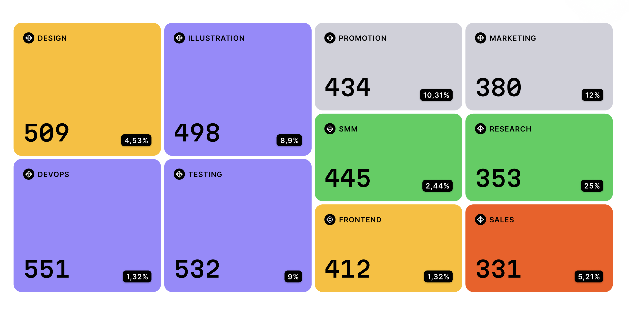
Treemap Chart
Treemap Chart is a data visualization chart that is used to display hierarchical data in a rectangular format. It is often used to show the relative size of different categories or data points within a larger dataset.
Plotting
To construct a Treemap Chart, you start with a rectangle that represents the entire dataset.
The rectangle is then divided into smaller rectangles, with each rectangle representing a category or data point.
The size of each rectangle is proportional to the value of the corresponding data point.
The chart can also be color-coded to represent different categories or groups in the dataset.
Summary
The Treemap Chart is often used to show the relative size of different categories or data points within a larger dataset.
It can help identify patterns and trends in the data, and highlight outliers or areas that require further investigation.
The chart is commonly used in business, finance, and scientific research to analyze complex datasets.
One advantage of the Treemap Chart is that it provides a clear and concise way to display hierarchical data in a rectangular format.
The design of the chart can be customized to include additional data points or to fit specific design requirements.
Additionally, the chart can be interactive, allowing for the exploration of different levels of data.
Overall, the Treemap Chart is a useful tool for visualizing hierarchical data in a rectangular format.
It is easy to construct and interpret, making it a popular choice for data visualization.
The chart is commonly used in business, finance, and scientific research to analyze complex datasets.