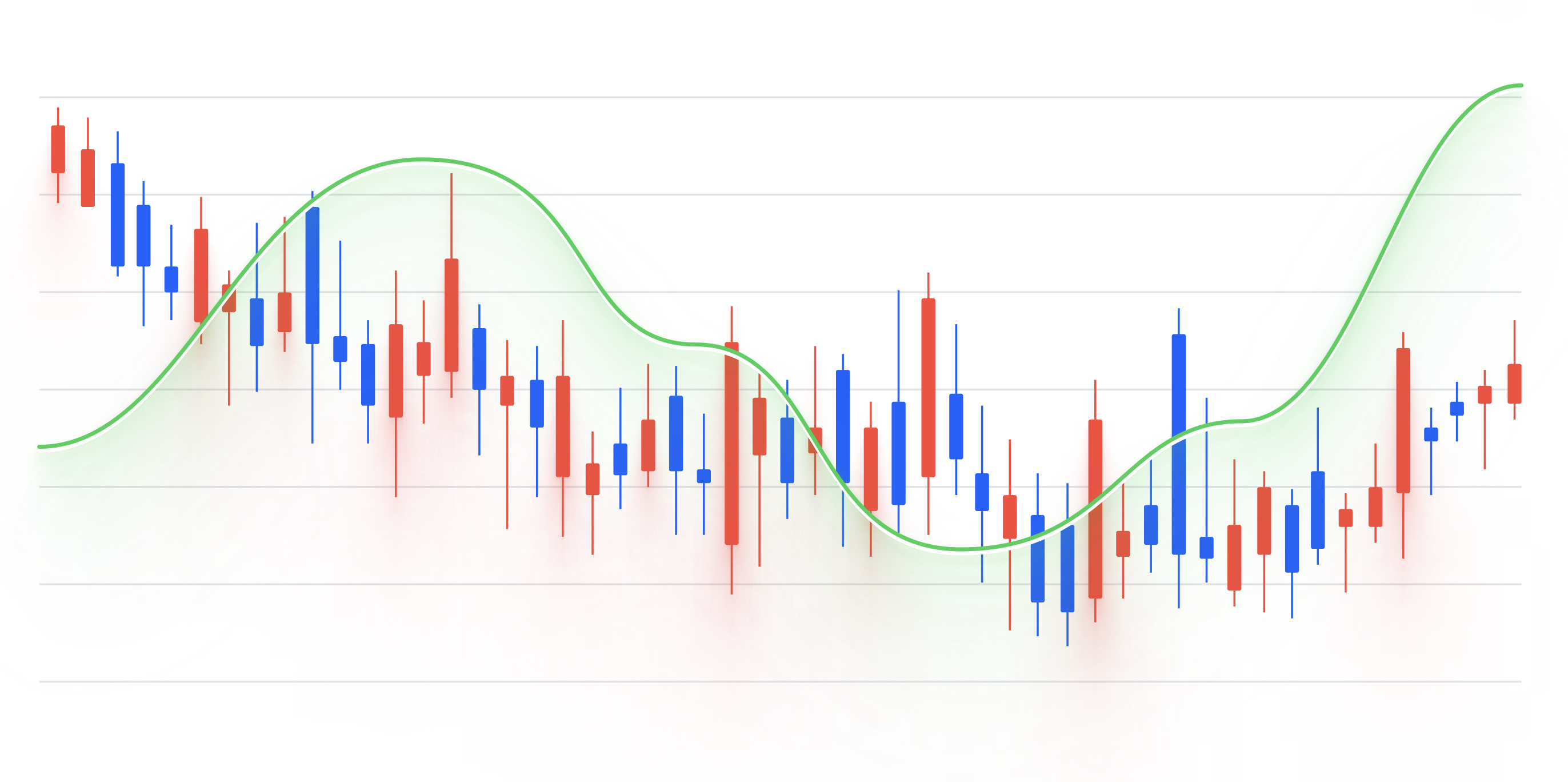
Candlestick Chart
Candlestick chart is a type of financial chart used to display the price movement of an asset over time. It is commonly used by traders and investors to identify trends and patterns in the market.
Plotting
To build a candlestick chart, you would typically need four sets of data for each time period: the opening price, the closing price, the highest price, and the lowest price.
Each time period is represented as a vertical line, with a rectangular "candle" shape at the top and bottom.
The top of the candle represents the highest price during the time period, while the bottom of the candle represents the lowest price.
The rectangular shape of the candle is colored differently depending on whether the closing price was higher or lower than the opening price.
If the closing price was higher, the candle is usually colored green or white; if the closing price was lower, the candle is usually colored red or black.
Summary
Candlestick charts are commonly used in finance and investing to visualize the price movement of stocks, bonds, commodities, and other assets.
They are often used to identify trends and patterns in the market, such as support and resistance levels, as well as to make predictions about future price movements.
Overall, candlestick charts are a useful tool for visualizing the price movement of an asset over time, and can help traders and investors make more informed decisions about buying and selling securities.