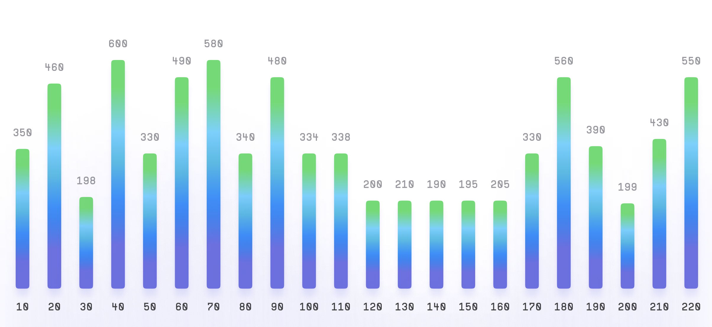
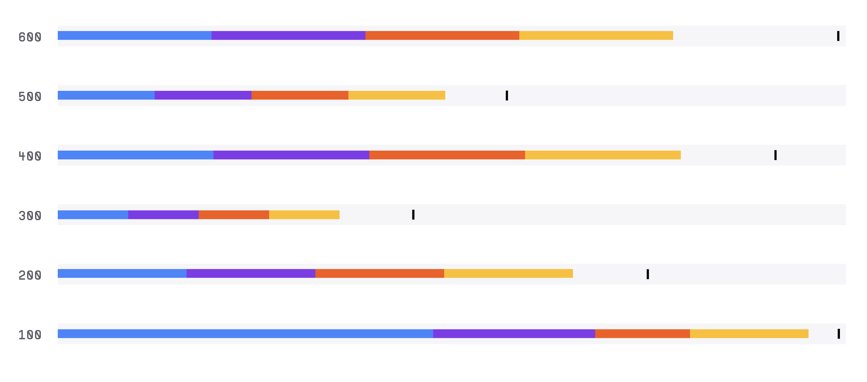
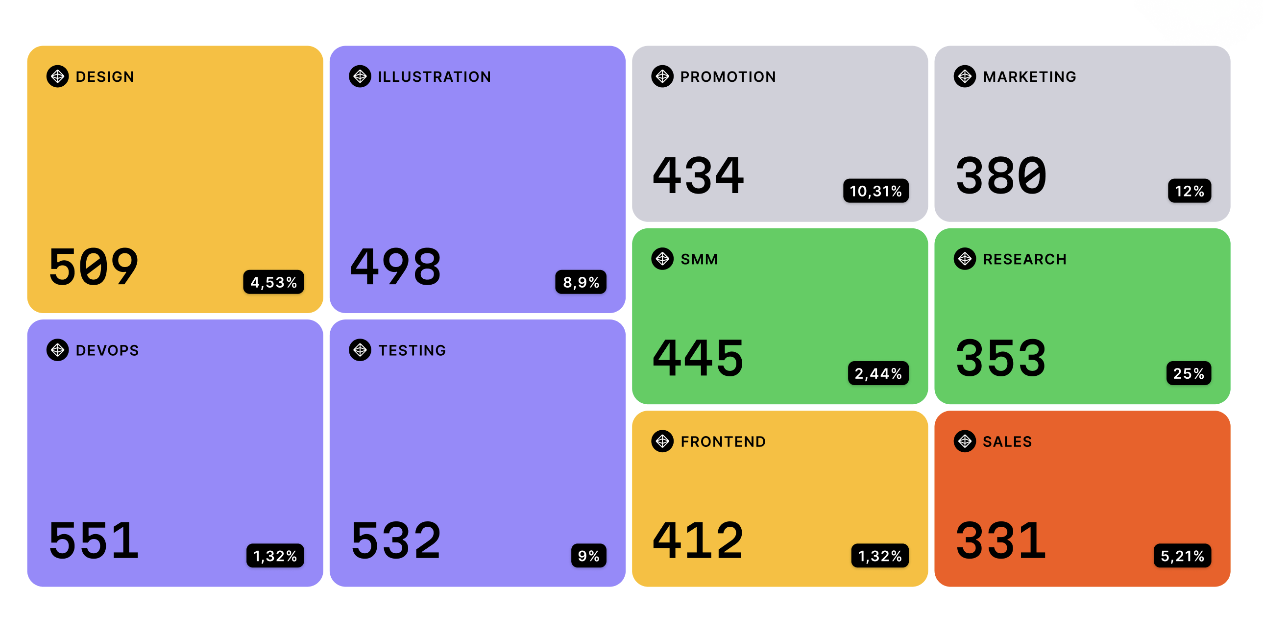
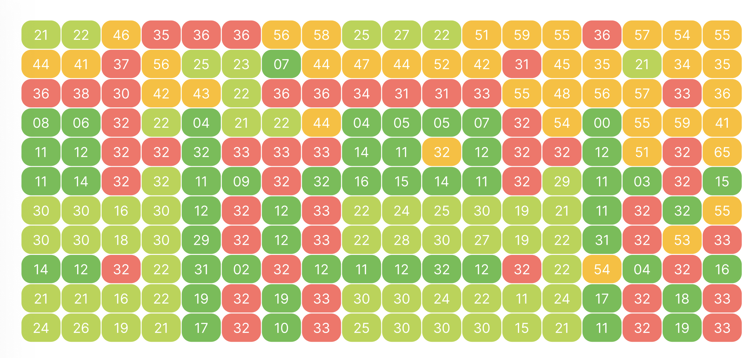
Heat Map
Heat Map, also known as a Heat Table, Density Table, or Heat Chart, is a data visualization chart that uses color to represent values in a matrix or table. It is often used to identify patterns or trends in large datasets.
Plotting
To construct a Heat Map, you start with a matrix or table of data, with rows and columns representing different variables or categories and cells representing the values for each combination of variables.
The values in each cell are then assigned a color, with higher values represented by warmer colors (e.g
red) and lower values represented by cooler colors (e.g
blue).
Summary
The chart is commonly used in business, finance, and scientific research to analyze complex datasets.
One advantage of the Heat Map is that it provides a clear and concise way to display large amounts of data.
The design of the chart can be customized to include additional data points or to fit specific design requirements.
Additionally, the chart can be interactive, allowing for the exploration of different levels of data.
Overall, the Heat Map is a useful tool for visualizing values in a matrix or table using color.
It is easy to construct and interpret, making it a popular choice for data visualization.
The chart is commonly used in business, finance, and scientific research to analyze complex datasets.