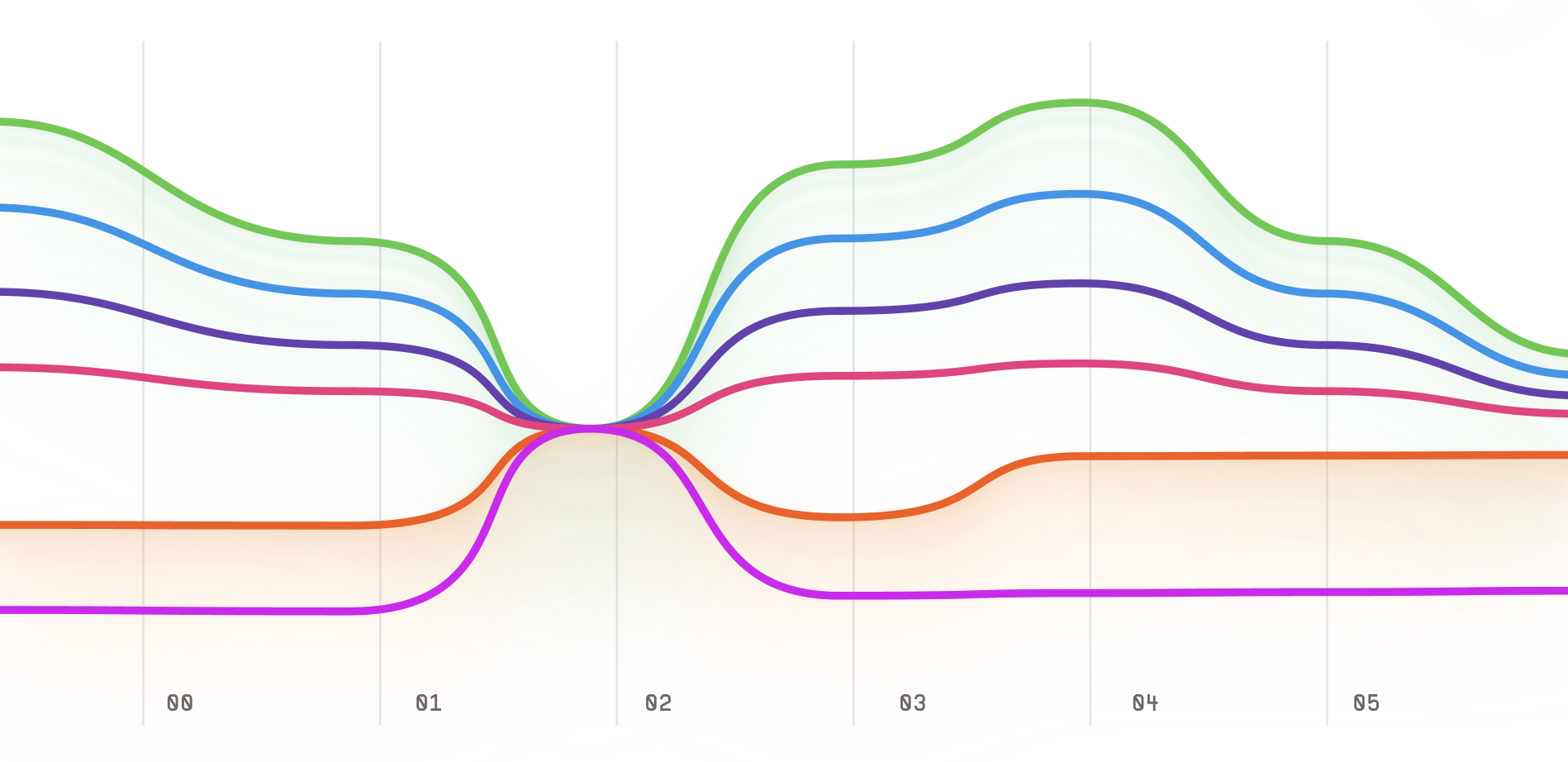
Parallel Coordinates Plot
The Parallel Coordinates plot is a data visualization technique used to visualize and analyze high-dimensional datasets. It is also called a Parallel Coordinate Plot because it uses parallel lines to represent different variables of a dataset.
Plotting
To construct a Parallel Coordinates plot, you start by placing a vertical axis for each variable of the dataset.
Each axis is then scaled to fit the range of the corresponding variable.
Next, you connect the values of each observation in the dataset with a line that passes through each axis.
The lines are then color-coded or labeled to represent different categories or groups in the dataset.
Summary
The Parallel Coordinates plot is often used to explore the relationships and patterns among variables in a high-dimensional dataset.
It can help identify clusters or patterns in the data that may not be evident by looking at individual variables.
The chart is particularly useful for datasets with more than three variables.
One advantage of the Parallel Coordinates plot is that it allows for the easy identification of outliers and patterns in the data.
By examining the intersections of the lines, you can quickly identify observations with unusual values or patterns that may require further investigation.
Additionally, the chart is easy to interpret and visually appealing.
Overall, the Parallel Coordinates plot is a useful tool for visualizing and analyzing high-dimensional datasets.
It is easy to construct and interpret, making it a popular choice for data visualization.