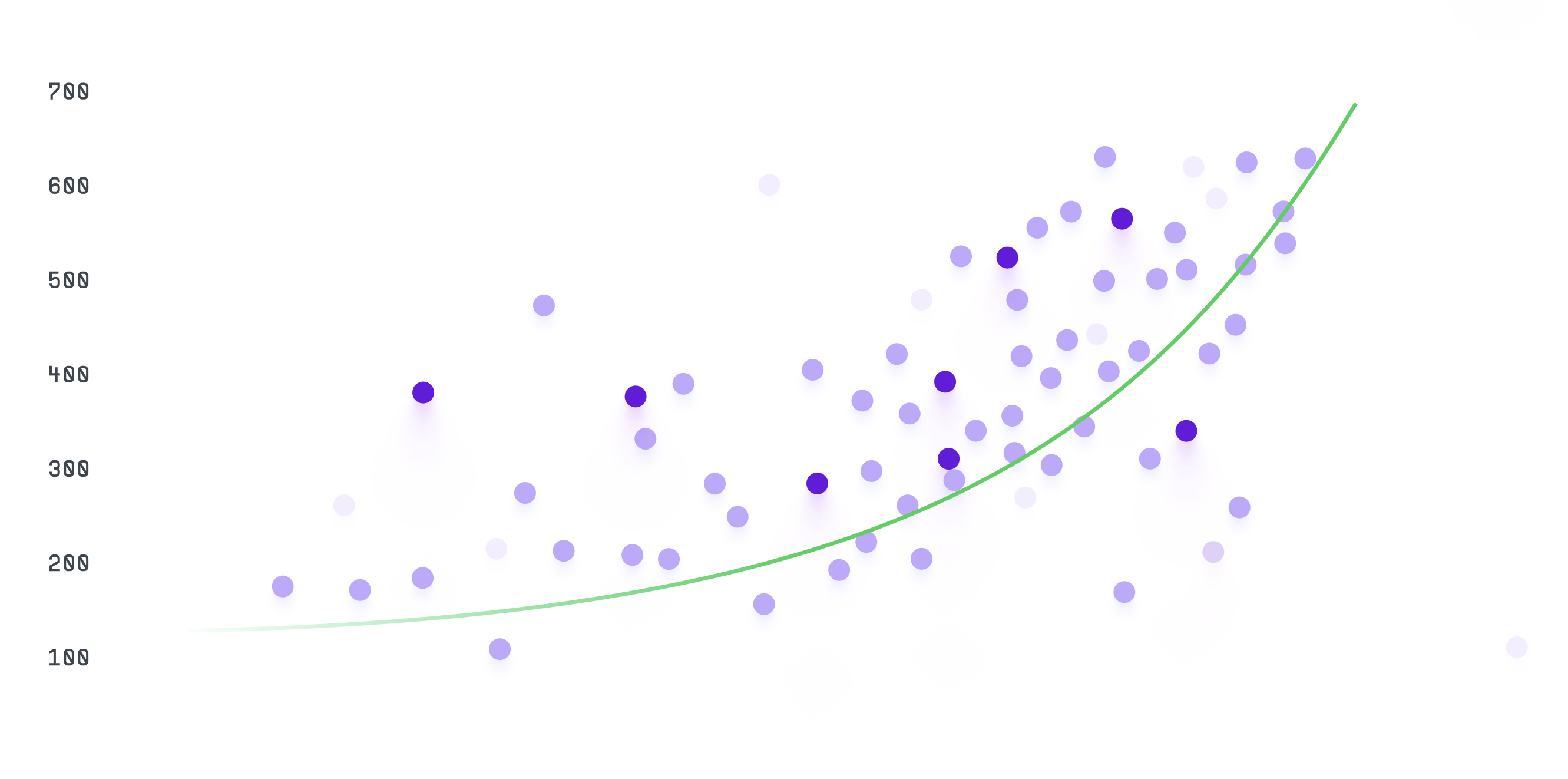
Scatter Chart
Scatter chart, also known as a scatter plot or scatter graph, is a type of chart used to display the relationship between two variables. It is commonly used to show how changes in one variable affect another variable.
Plotting
To build a scatter chart, you would typically need two sets of data: one for the x-axis and one for the y-axis.
Each data point represents a value for both variables, and is plotted as a point on the chart.
The points are not connected by lines, as in a line chart, but are instead scattered across the chart.
Summary
The points are not connected by lines, as in a line chart, but are instead scattered across the chart.
Scatter charts are commonly used in scientific research, engineering, and other fields to visualize data that shows a relationship between two variables.
For example, a researcher might use a scatter chart to show how changes in temperature affect the growth rate of a particular organism.
Scatter charts are also useful for identifying trends and patterns in data, such as correlations or clusters of data points.
They can help people understand complex data sets and make predictions based on the relationships between variables.
Overall, scatter charts are a useful tool for visualizing the relationship between two variables, and can be used in a variety of fields to help people understand complex data sets.