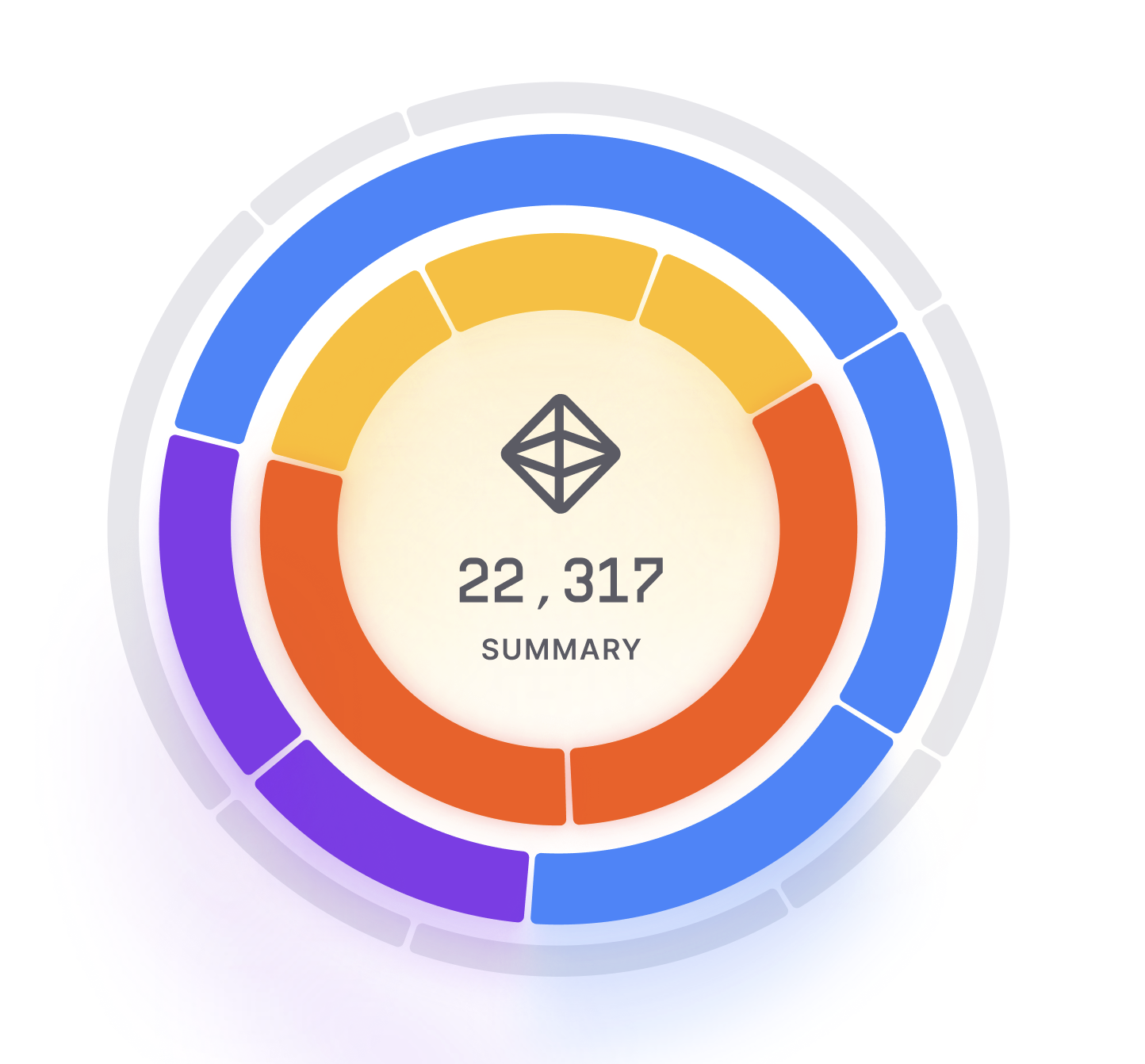
Sunburst Chart
Sunburst Chart is a data visualization chart that is used to display hierarchical data in a circular format. It is similar to a tree chart, but uses a radial layout to represent the data. The chart is often used to show the relationships between different levels of categories or data.
Plotting
To construct a Sunburst Chart, you start with a circle in the center, representing the top-level category or data point.
From the center, you add rings that represent the next level of categories or data points.
Each subsequent level is represented by an additional ring.
The chart is divided into segments, with each segment representing a category or data point.
The size of each segment represents the value of the data point.
Summary
The Sunburst Chart is often used to show the hierarchy of data or relationships between different categories.
It can help identify patterns and trends in the data, and highlight outliers or areas that require further investigation.
The chart is commonly used in business, finance, and scientific research to analyze complex datasets.
One advantage of the Sunburst Chart is that it provides a clear and concise way to display hierarchical data in a circular format.
The design of the chart can be customized to include additional data points or to fit specific design requirements.
Additionally, the chart can be interactive, allowing for the exploration of different levels of data.
Overall, the Sunburst Chart is a useful tool for visualizing hierarchical data in a circular format.
It is easy to construct and interpret, making it a popular choice for data visualization.
The chart is commonly used in business, finance, and scientific research to analyze complex datasets.